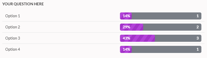
It’s now possible to control the visualizations for responses given to multiple choice questions on myTIPreport. When viewing the responses to multiple choice questions, one common scenario is to want to see the distribution of answers. myTIPreport now supports showing this type of distribution on the insights page:
Another common scenario with multiple choice questions is to have the options represent different learning levels. In this case, the desired visualization is usually one that shows an average of the most recent options selected. myTIPreport now supports this as well:

Both of these options can be configured via the Advanced tab on the question customization form. If you’re interested in learning more about form customization, see our help docs here.
Do you have other suggestions for visualizing responses to multiple choice questions? If so, please reach out to us at [email protected].